They always say that you should “never judge a book by its cover”, but it’s also true that first impressions matter. Why else would first impressions matter if your metaphorical cover wasn’t being judged? This might not be the best place to get philosophical, though we can all agree that as much as we shouldn’t judge things on first glance, we’re all a bit guilty of it.
Video games certainly aren’t immune from our judging eyes, and in a lot of cases, gaming doesn’t do enough of a good job of discouraging us from our judgmental ways. There’s too many cases of terrible box art out there, and while some serve as effective warning signs for terrible games, others are simply bad first impressions for stellar games. This is by no means an exhaustive list, but here’s 20 examples of bad video game box art, and whether or not you were right to judge the game by its terrible cover.
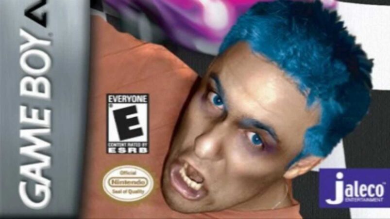
1. 8 To Glory
What’s On The Box Art? – ‘Murica. It might not be fair to expect high art from the box art for a game about professional bull riding, but even still, this box art is hilarious. Maybe it’s the unsettlingly blue eyes of the cowboy guy on the front cover. He looks almost possessed, though admittedly, a game about a paranormal bull rider would be more interesting than 8 To Glory.
What’s In The Box? – A couple of seconds of gameplay spread out across a dozen or so hours, 8 To Glory is just a series of rhythm action games repeated ad nauseum. In fairness, bull riding was never going to lead to gaming’s next big thing, but that doesn’t mean 8 To Glory is worthy of your time either.
2. Batman: Arkham City – Game Of The Year Edition
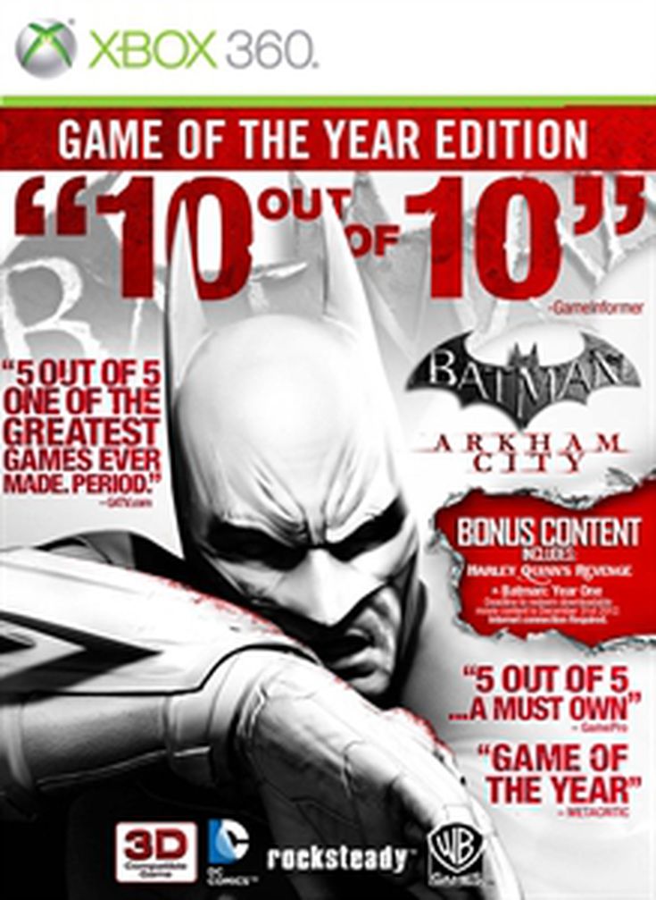
What’s On The Box Art? – What can we possibly say about the GOTY version of Batman: Arkham City’s cover that hasn’t already been said? The original version of the cover is fantastic, with the white background and black and white image serving as a stark contrast to The Dark Knight’s usual black and gloomy affairs. Unfortunately, in Rocksteady’s excitement to share how successful the game was, the GOTY was littered with scores, critic quotes and bullet points for the season pass content. Never mind busy, this box art was a stress breakdown.
What’s In The Box? – Arguably the series highlight, Batman: Arkham City was a brilliant stealth/beat ‘em up hybrid that not only masterfully utilised the extensive lore of the Caped Crusader, but also accurately conveyed the psychology of how Batman operates. Saying a game makes you feel like the title character is a bit of a cliche, but the Arkham series helped make that notion a cliche in the first place. Terrific stuff, even if the box art is god awful.
3. Binary Domain
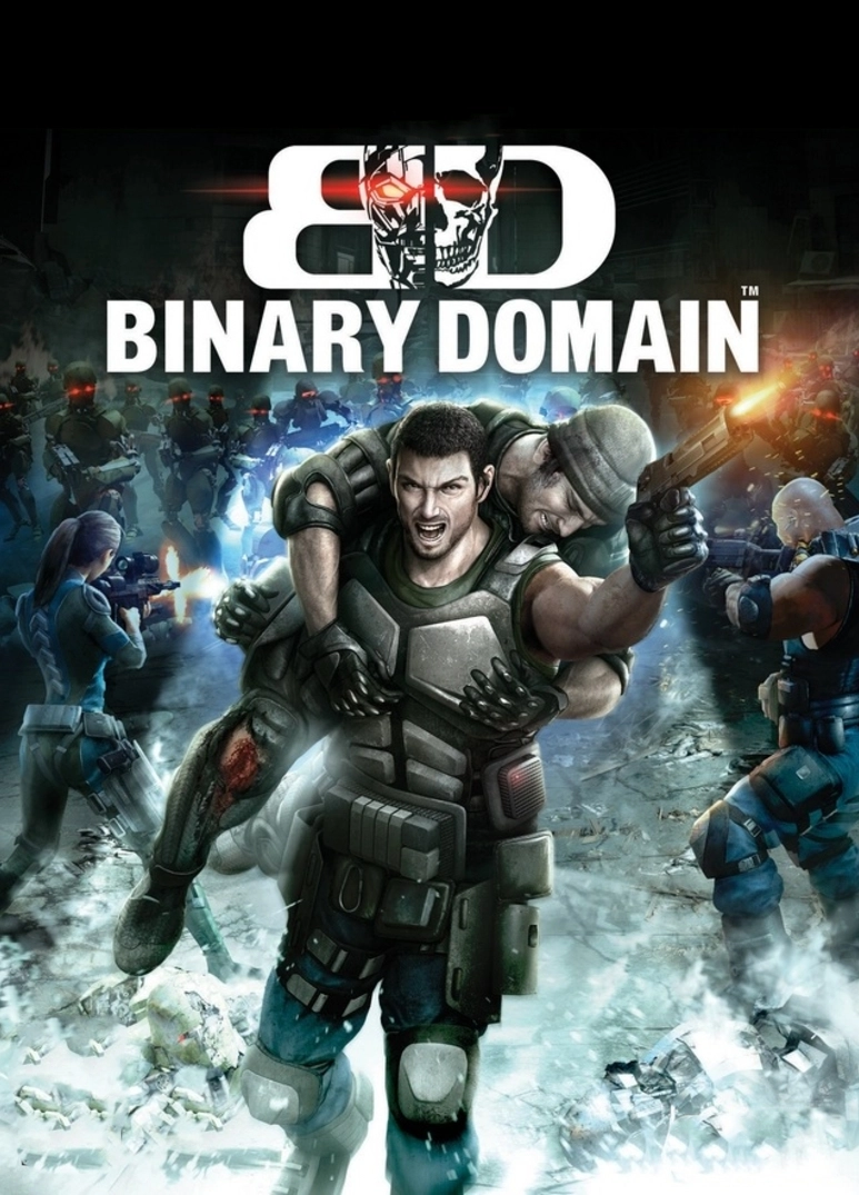
What’s On The Box Art? – This one feels like a crime. As much as it’s easy to bag on games with objectively terrible box arts, at least they’re eye-catching and memorable. The biggest issue with Binary Domain’s box art is how generic it feels. Launching after the success of cover-based shooters like Gears Of War, there’s nothing in Binary Domain’s box art to suggest it isn’t just another clone.
What’s In The Box? – The reality is that Binary Domain offers one of the best cyberpunk and transhumanism stories in gaming, wrapped up in the bow of a tight, well-made third person shooter. Unfortunately, the mix of average critical reviews and (possibly) the terribly derivative box art, meant that Binary Domain never got the reception it deserved. Fortunately, it’s backwards compatible on Xbox One and Xbox Series X | S now, so you’ve got time to right your wrong.
4. Bust-A-Move 2: Arcade Edition
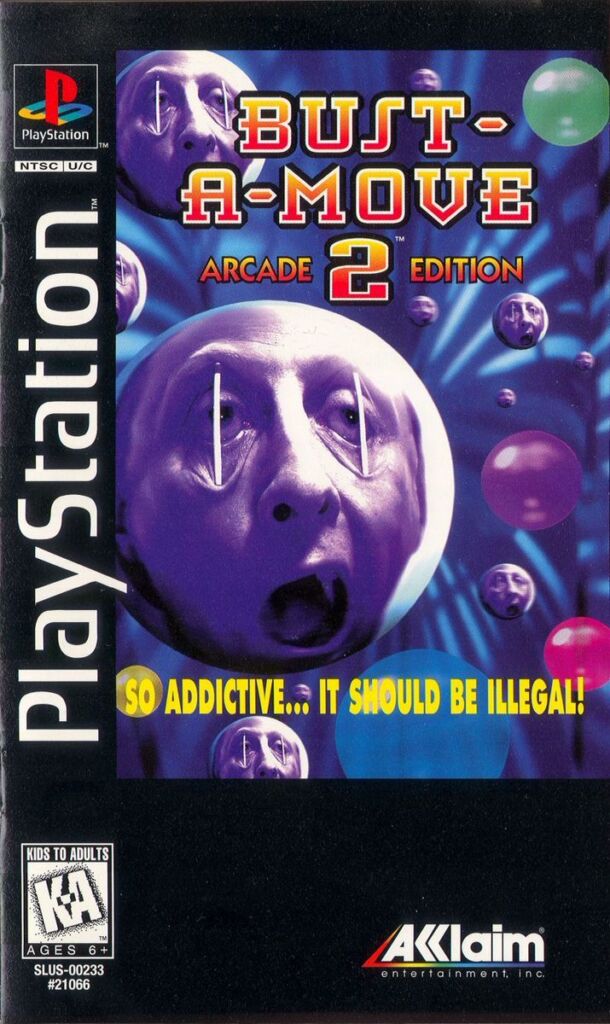
What’s On The Box Art? – Were Bust-A-Move covers contractually obligated to be absolutely abhorrent, or did the process just happen naturally? The PS1 version of Bust-A-Move 2: Arcade Edition featured different balls, all of which showcasing someone with their eyes being pried open by matchsticks like some kind of sick “A Clockwork Orange” experiment. The tagline reads “So Addictive… It Should Be Illegal”, glossing over the clear Geneva Convention violations this cover shows.
What’s In The Box? – Bust-A-Move 2: Arcade Edition features the same gameplay that you might recognise from that old Sky TV game Beehive Bedlam. Reviews for the PS1 version specifically are hard to come by, but it’s safe to say that if you like the gameplay of Bust-A-Move, you’ll be alright with this one.
5. Eat Lead: The Return Of Matt Hazard
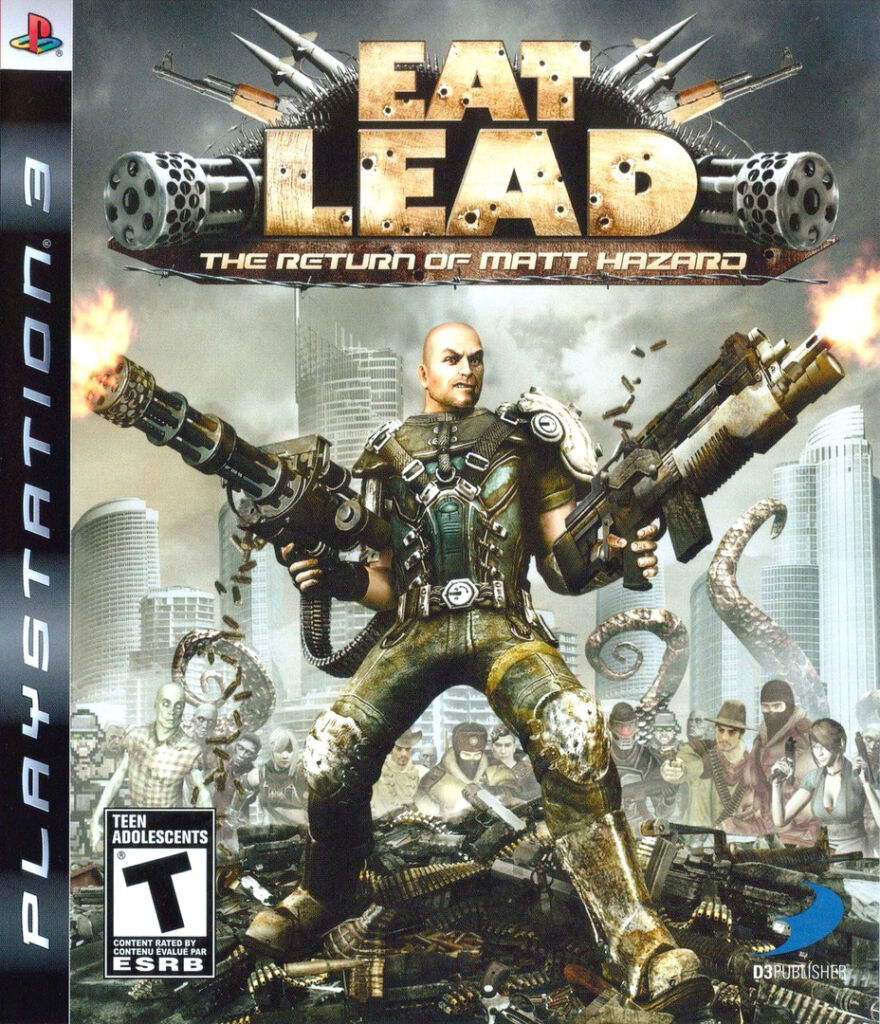
What’s On The Box Art? – For a game that was designed to lampoon the gaming industry as a whole, Eat Lead: The Return Of Matt Hazard’s cover sure makes it look like another generic shooter, only with a lot more brown and grey than usual. You could argue that makes it a brilliant parody of all the shooters that launched in the Xbox 360/PS3 era, which is fair enough, but it also makes it incredibly hard to stand out from the pack.
What’s In The Box? – Depending on who you ask, it’s either a pretty funny parody of video games, or it’s a pretty terrible third person shooter. There’s little to no middle ground there. While it’s a good way of bolstering your gamerscore, with achievements that pop just by starting the game’s story, Eat Lead’s not much to write home about. It’s got Will Arnett and Neil Patrick Harris in it though, which is something, I suppose.
6. Hot Brain
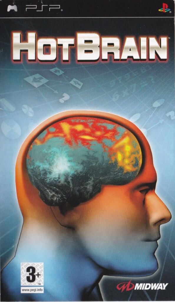
What’s On The Box Art? – Have you ever sat on public transport and noticed an advert for the latest kind of headache or other general pain relief medication? Hot Brain’s cover looks exactly like that, which makes sense considering it’s about making the brain hot, I think? There’s also weird shapes in the background. It’s not the worst box art ever, but it’s noteworthy for how vague it is.
What’s In The Box? – A brain training game for the PSP, Hot Brain sits at a 64 on Metacritic, making it decidedly average. While the Nintendo Brain Training games featured Dr. Kawashima, Hot Brain’s biggest claim to fame was noted comic actor Fred Willard providing some voice acting. Honestly, they should have stuck him on the box art.
7. ICO
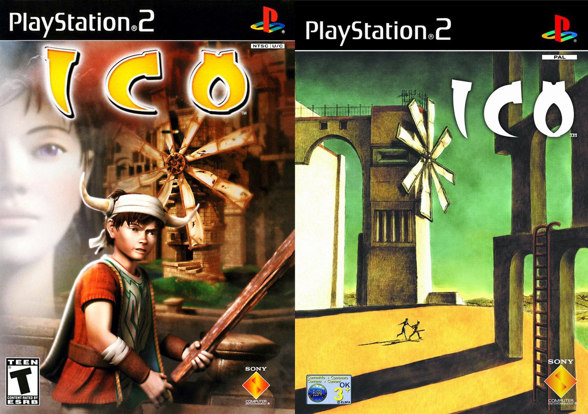
What’s On The Box Art? – Depending on where you live, the cover for the iconic PS2 adventure game ICO is radically different. If you live in Europe and Japan, the box art is a rather tasteful and artistic landscape showcasing the sheer scale of the two main characters’ attempts to escape. If you’re in the US though, you’re treated to perhaps the most generic fantasy game cover ever.
What’s In The Box? – Nothing short of a masterpiece for the PS2, ICO sits at a well deserved 90 on Metacritic. One of the PS2’s first wow games in terms of visuals, ICO possessed atmosphere in spades, creating a memorable and engaging journey from start to finish. It’s just a shame that a lot of players wouldn’t have experienced it because they were put off by the default Oblivion protagonist on the game’s cover.
8. Karnaaj Rally
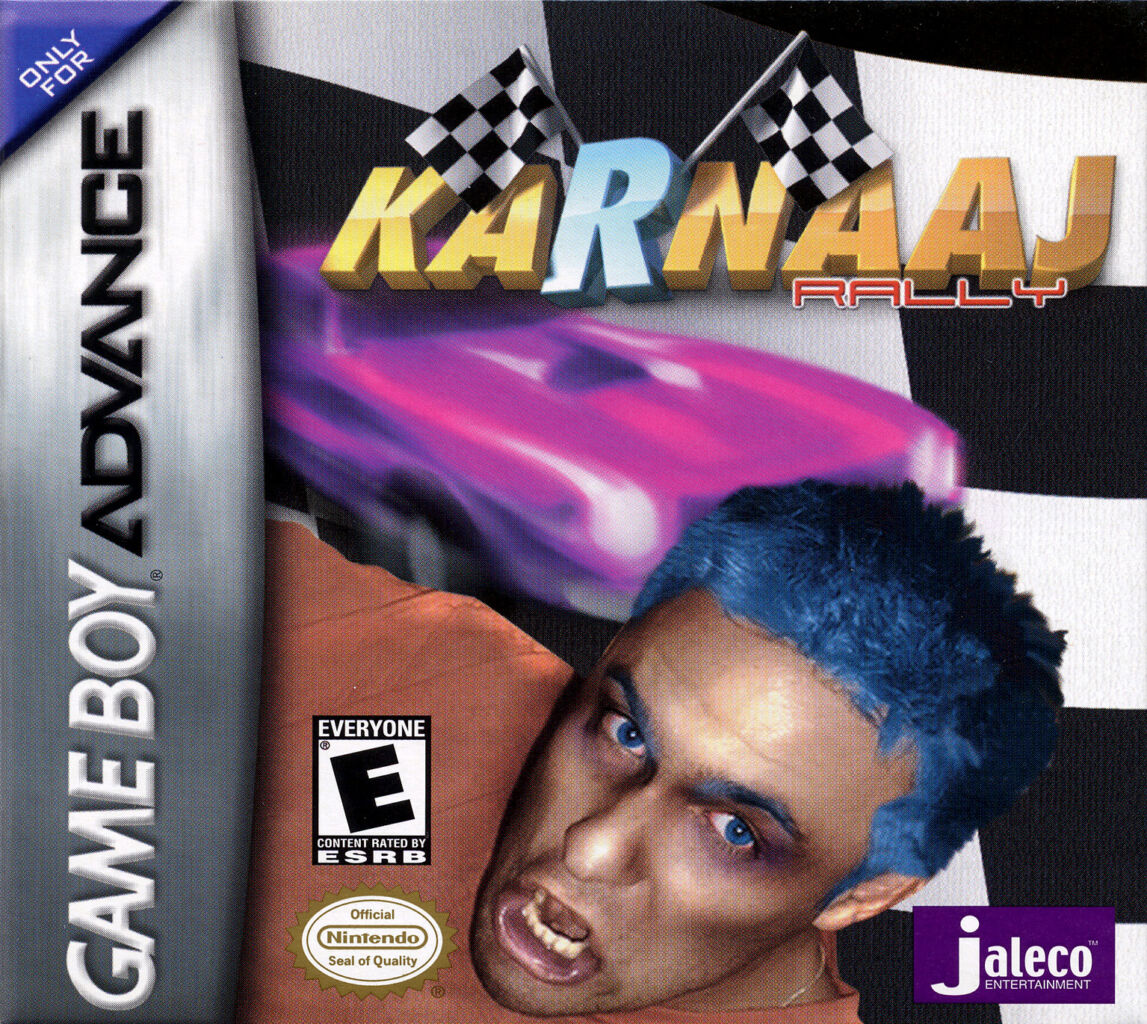
What’s On The Box Art? – It can’t just be me who thinks that the box art for Karnaaj Rally looks like the early prototype for YouTube thumbnails? Like all great terrible box arts, Karnaaj Rally is hard to look away from. The chequered flag background, weird title font and big pink car are all disparate elements anyway, but the real star attraction is the blue hair fusion between Ray William Johnson and Till Lindemann. Why is he here? What’s on his face? Why is he screaming? These questions will perhaps never be answered.
What’s In The Box? – For as terrible as the cover is, Karnaaj Rally might just take the cake as one of the best games on this list. A top down racing game/car combat experience, Karnaaj Rally would likely be considered the best racing game on GBA if it wasn’t for the small matter of Mario Kart: Super Circuit. Still, you definitely shouldn’t judge this game by its admittedly absurd cover.
9. Mega Man
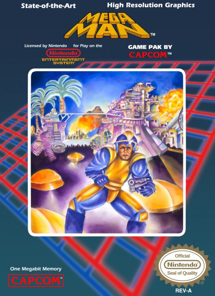
What’s On The Box Art? – Perhaps one of the most legendary blunders when it comes to gaming box art, Mega Man’s original outing wasn’t given the best chance it could to succeed. The original cover for the US version of Mega Man looks like the Tron that your mum says you have at home, with oddly proportioned Mega Man awkwardly posed in front of a shiny metropolis for no discernable reason.
What’s In The Box? – A titan of action platformers, Mega Man’s legacy in gaming almost managed to outlive the legacy of the terrible box art. Almost. At least Capcom were able to laugh about it by making Bad Box Art Mega Man a playable character in Street Fighter X Tekken.
10. Okami
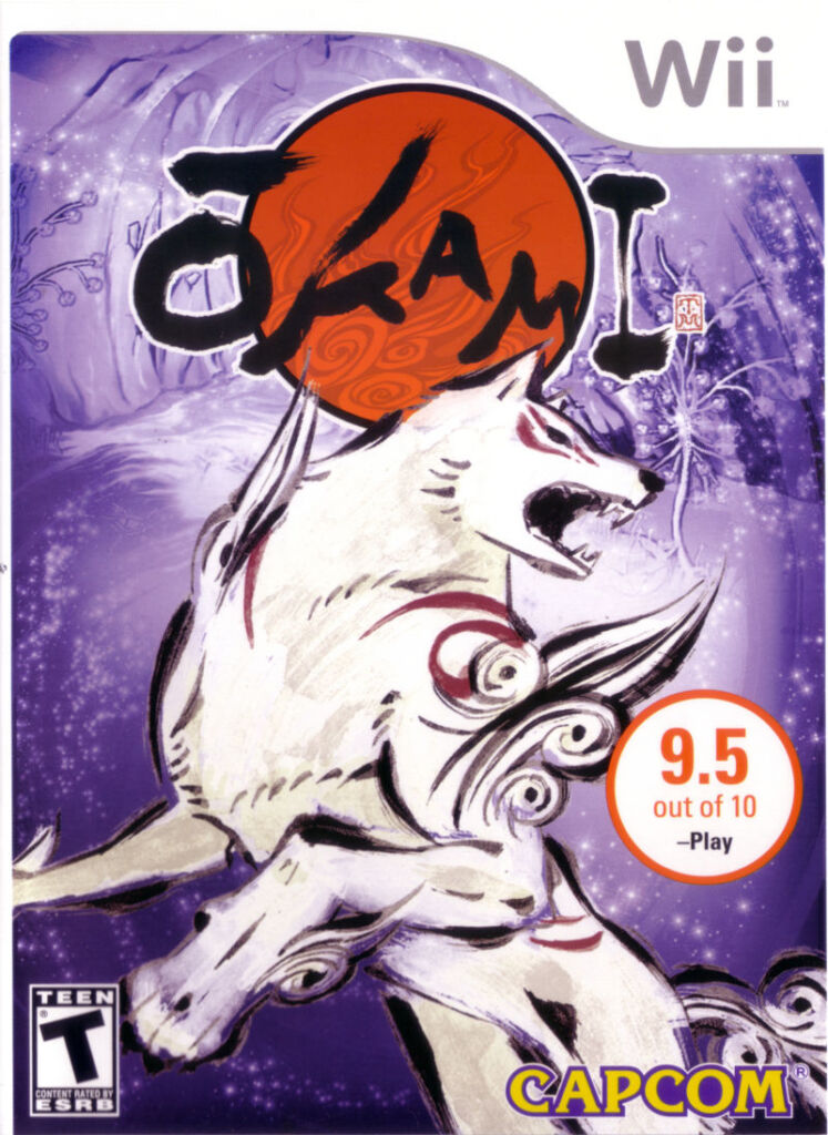
What’s On The Box Art? – Not all box art is terrible on purpose, or is subjectively terrible if you happen to be a fan of whatever Karnaaj Rally is going for. Some box art is terrible because of some serious mistakes, and there are few more famous than the Wii release of Okami. After a successful launch on PS2, the game was ported to the Wii with a new cover art, only someone decided to use an image with an IGN watermark badly photoshopped out. Talk about a big oof.
What’s In The Box? – Quite simply, Okami is one of the most imaginative, beautiful and awe-inspiring adventures in gaming, so a cover as neglectful as the Wii port’s is about as damaging as it gets. It doesn’t matter how amazing a game is when the cover has such a huge mistake on the cover, but it could have been worse for Capcom. They could have released Resident Evil: Revelations on the DS with the game spelt “Revalaitons”. Oh, wait.
11. Phalanx
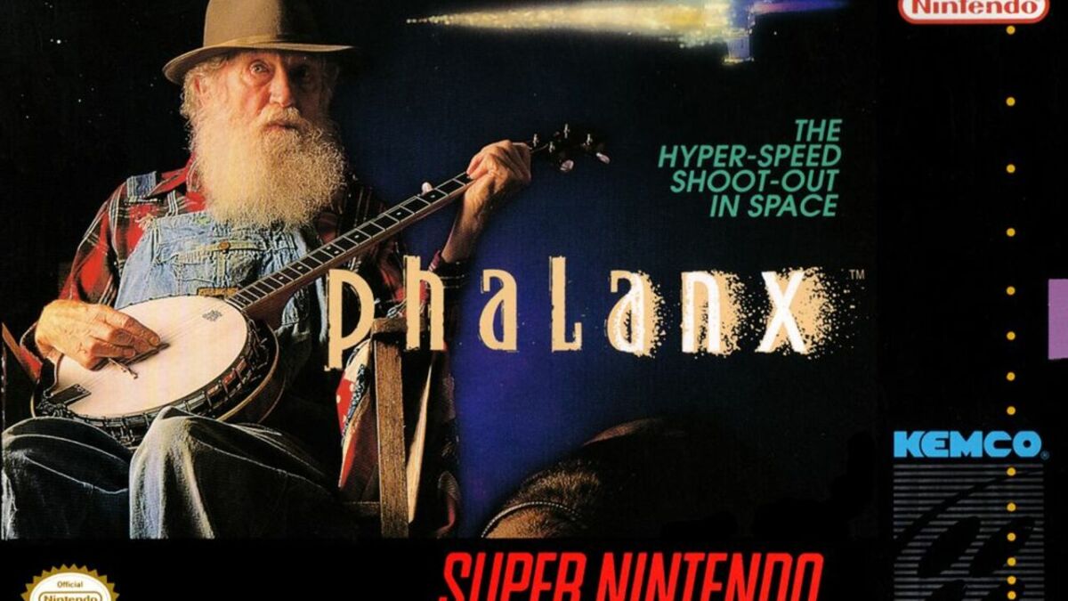
What’s On The Box Art? – I’m genuinely not sure which side of the border Phalanx’s cover sits on: genius or insanity. While the tagline boldly proclaims Phalanx to be “The Hyper-Speed Shoot-Out In Space”, your eyes are only going to be drawn to the Willie Nelson knock-off sat playing a banjo on a rocking chair. Reportedly, the cover was made to be deliberately bizarre so people would talk about it, so I guess they got me, huh? Genius, it is.
What’s In The Box? – In that same story linked above, one of the minds behind the cover art admits that the box art was the most interesting aspect of Phalanx, and that notion translates into reviews. While the box art is for the SNES version of the game, the GBA reviews tell the story of a decent enough side-scrolling shooter, but certainly not one worth going out of your way for.
12. Phoenix Games’ Back Catalogue
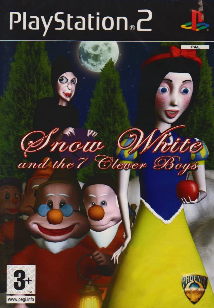
What’s On The Box Art? – Phoenix Games might not be a household name when it comes to games, but oh boy, most of their releases featured awful box art in some form or another. While it’s hard to nail down a particular worst offender, two notable examples include Snow White And The Seven Clever Boys and Street Warrior. Finkles World also looks like a saccharine hellscape.
What’s In The Box? – Phoenix Games were a developer and publisher of games across many genres, but one aspect linked them all together: they were all a bit naff. The three games mentioned above serve as Phoenix Games’ legacy, providing some of the worst box art and games that the PS2 has ever seen. If you can think of worse, I’d love to see it, but if you say God Hand’s cover, you’re a bad person.
13. RAW Danger
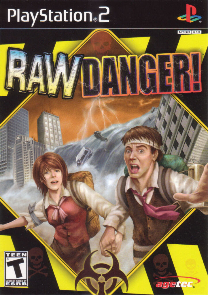
What’s On The Box Art? – Danger, in perhaps its rawest form. The cover of RAW Danger sees two survivors screaming in terror as a tsunami looms behind them. While that’s fine in theory, and gives you a general idea as to what RAW Danger is all about, there’s something incredibly ugly about the people depicted that turns the case into some b-movie cringefest. The yellow and black tape combined with the biohazard symbol doesn’t help.
What’s In The Box? – While the box art looks goofy, the actual game isn’t quite so daft. A survival game, you control a host of different characters as they attempt to survive disasters both natural and man-made. The game would eventually receive a 63 on Metacritic, with most reviewers praising the game’s originality in comparison to other games on the market, but its ambition was too much for its own good.
14. Resident Evil 6
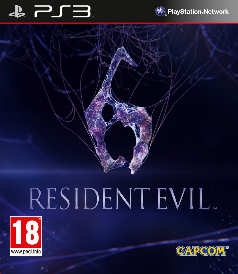
What’s On The Box Art? – So, the font for Resident Evil 6 looks fine. There’s a nice serif font, it looks okay. The purple background also looks alright too. Not sure what else there is to say about this one, aside from the number six at the top that looks like a giraffe being given a bit of a happy ending. Oh, and the six itself looks like it’s made out of semen. You know, just a normal, not at all ridiculous cover.
What’s In The Box? – Another case of the cover art being a warning sign for what lies within, Resident Evil 6 is widely regarded as one of, if not the worst mainline game in the series. With no real horror to speak of, an insistence on co-op gameplay and a campaign that felt like it lasted 30-40, which is nearly 35 hours too long, Resident Evil 6’s worst crime still happens to be the box art. Yes, it’s that bad.
15. Super Bust-A-Move
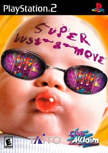
What’s On The Box Art? – Super Bust-A-Move’s boxart can only be described as the cousin of that giant baby from Zombies Ate My Neighbours eating a large piece of candy in a cover that’s horrifying and hard to repress. The baby is also wearing some big sunglasses that are reflecting the iconic Bust-A-Move gameplay. If you’re yet to have nightmares about babies, this’ll be the cover to do it.
What’s In The Box? – The PS2 release of Super Bust-A-Move reviewed decently, earning a 75 on Metacritic. The gameplay is the same colour matching, bubble busting puzzles that players had already enjoyed for a decade prior, so it wasn’t exactly a reinvention of the wheel, but it was decently fun all the same. That’s if you can get past the awful cover anyway.
16. Tao Feng: Fist of the Lotus
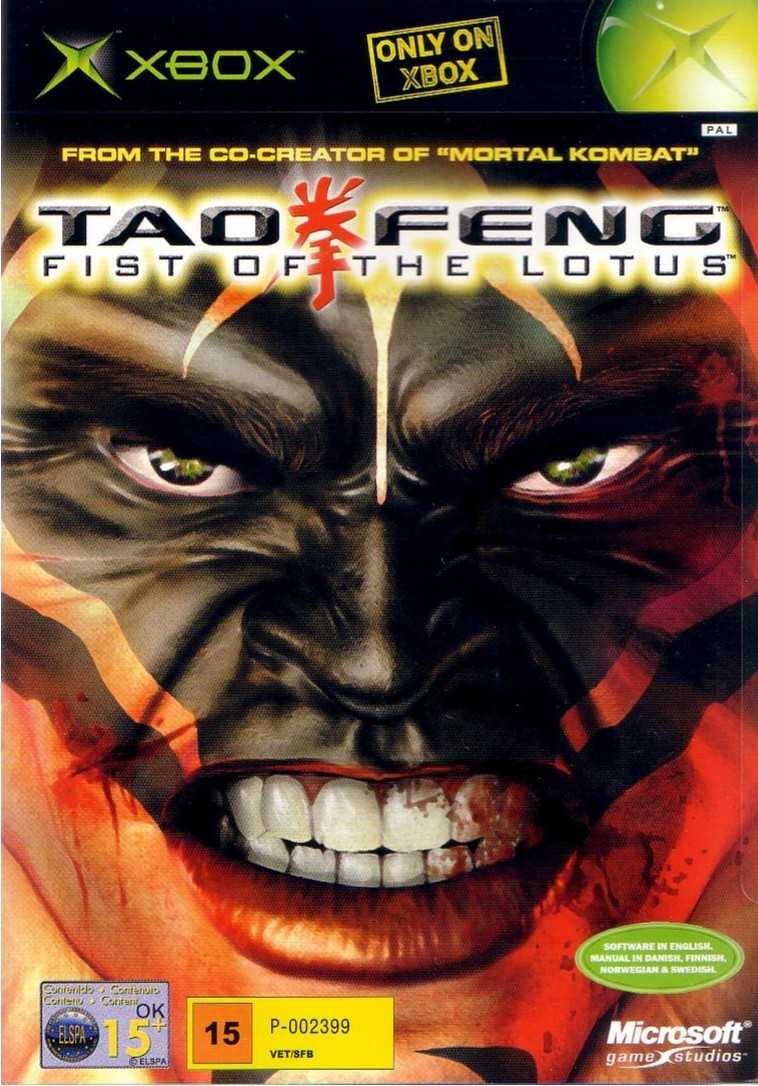
What’s On The Box Art? – The words “From the co-creator of Mortal Kombat” are about the only visual clue you’ll have when trying to determine what the hell Tao Feng: Fist of the Lotus actually is. From the name and credit alone, you could imagine that it’s a fighting game, but the snarling man who looks like he’s mid-constipated poo wouldn’t help you at all.
What’s In The Box? – Reviews for this fighting game are middling at best, as many would praise the overall presentation of the game via the environmental damage you could cause during a fight. However, the overall gameplay is about as sloppy as the cover art work, with each character’s moves translating into a nigh incomprehensible series of flips. Better to avoid this one.
17. This Is Football 2002
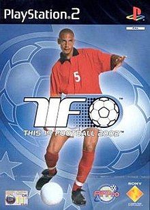
What’s On The Box Art? – Football game covers have always opted to use notable professional players when advertising their games, and This Is Football 2002 is no exception. Typical football game covers either show the players as jovial, because football is fun, or serious, because nothing conveys enjoyment like a frowning football player. TIF 2002 opts for Rio Ferdinand kicking a ball while looking bored out of his skull. Safe to say, this one missed the goal by a wide margin.
What’s In The Box? – Considering the fact that mainstream football games have basically boiled down to just FIFA or Pro Evo (sorry, eFootball now), it’s not a surprise that This Is Football 2002 didn’t exactly set the world on fire. Critics marked the game down for weak AI and tactics, but the game also featured a button where you could intentionally dive at any time, and that needs to be brought back.
18. Virtua Fighter 2
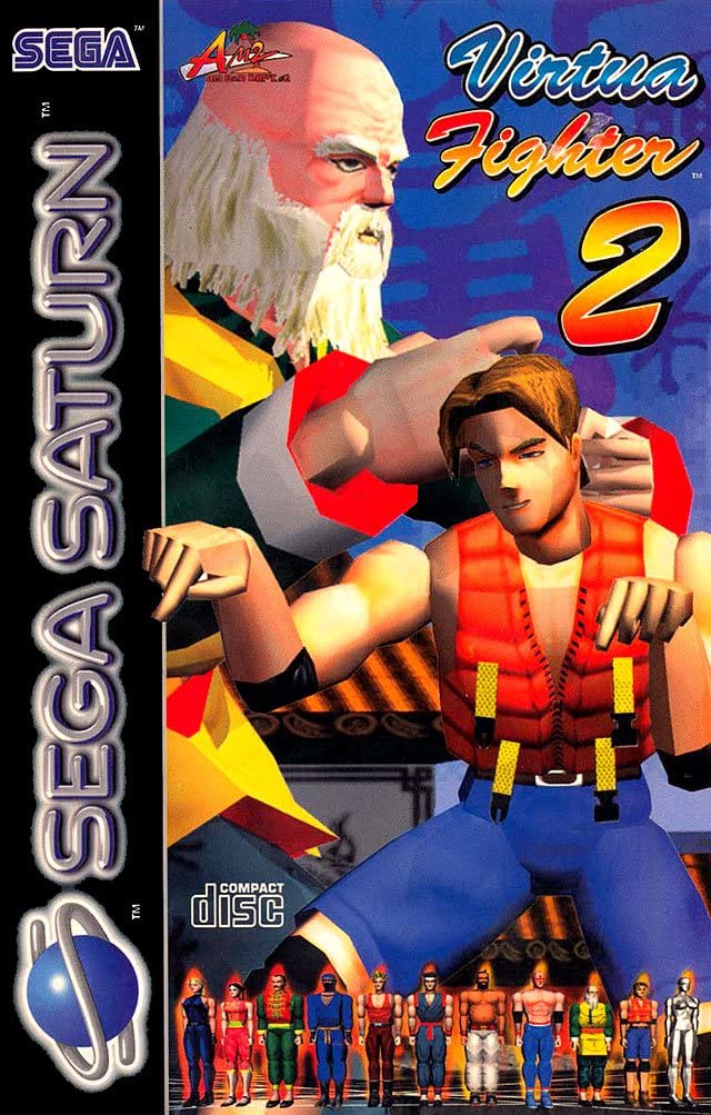
What’s On The Box Art? – A box art that’s possibly made worse by age, unfortunately, Virtua Fighter 2’s box art for the Sega Saturn looks like a clunky vomit of colour. Lion and Shun-Di being given pride of place on the cover don’t look their best, and again that might be age, but the more perplexing aspect of this cover is the doll-like poses that the rest of the roster are in at the bottom of the cover.
What’s In The Box? – A forefather of the fighting game genre, Virtua Fighter 2 is considered to be a legendary 3D fighter that helped to shape fighting games of today. With the Virtua Fighter series still going strong with VF5: Ultimate Showdown on PS4 and PS5, and the potential of VF6 in the pipeline, clearly the series wasn’t tainted much by this questionable cover. Still, that doesn’t mean it’s a good cover.
19. Warhammer 40K: Deathwatch
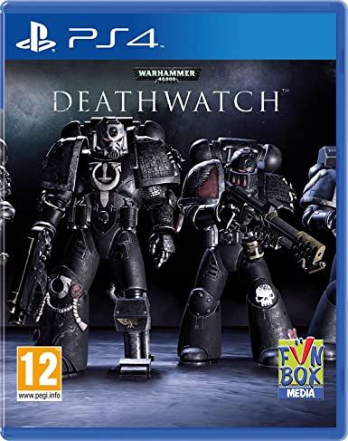
What’s On The Box Art? – With such a rich world and lore to pull from, any developer of a Warhammer 40K game should be able to create box art that catches your eye and demands your attention. Half of 40K’s battles look like the Doomslayer himself ripping and tearing through hordes of enemies, so why does Deathwatch’s cover look like a placeholder for a placeholder? Just black armoured space marines on a black background. I’m bored, let’s move on.
What’s In The Box? – A mobile game that’s being sold for full price, essentially. The core strategy gameplay is decent enough, but the only real enhancements that have come during the transition between mobile and console is the fact that you can play on a controller. Isn’t the future exciting? If you’re looking for a shining example of Warhammer 40K in the console gaming space, Deathwatch isn’t it.
20. WCW Backstage Assault
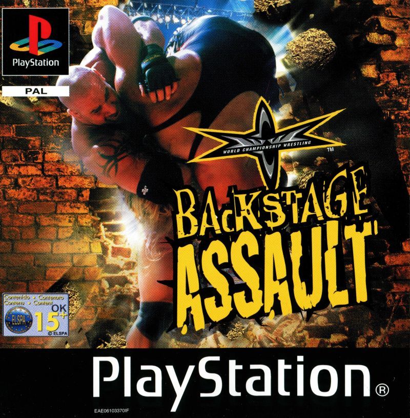
What’s On The Box Art? – Many wrestling fans look back on the Monday Night Wars and the Attitude Era as perhaps the best time period in the history of the sport. However, it’s hard to deny the era was very edgy. The WWF music album called Forceable Entry springs to mind. WCW Backstage Assault’s name probably came from a similar place, but the cover conveys none of that edgy excitement. It’s just Goldberg throwing an unnamed singlet man through a wall. At least that’s what it’s meant to look like, I think. The end result is just a bit crap.
What’s In The Box? – Considering it was the final ever WCW game before the company was purchased by WWF, and it was released after original WCW game developers defected to WWF, Backstage Assault is a mess. If nothing else, you could say that the game accurately reflected the state of WCW at the time, but no one wants to pay full price for a game that’s not very good, even if it’s unintentionally realistic.
READ MORE:
Some of the coverage you find on Cultured Vultures contains affiliate links, which provide us with small commissions based on purchases made from visiting our site.